
ShootProof Design System
Laying the groundwork for a scalable, inclusive system.
The situation
Four acquisitions in quick succession sounds exciting, and it was, but it also meant four different sets of design habits, patterns, and assumptions all colliding inside the same product. There was barely any shared documentation, and the result of that was teams were building in parallel without a common language.
It worked fine for a while. But as design grew, the cracks started showing. Shipping anything new meant rediscovering decisions that had already been made somewhere else. It wasn't sustainable.
My first move was to just go look at everything. I did a deep audit alongside designers and developers to discover what patterns were actually working, what was broken, what was duplicated, and what was quietly causing pain nobody had named yet.
From there I built a plan and started consolidating. The goal was a shared component library that teams could actually rely on, so that every new feature didn't start from zero, and so new acquisitions had something real to plug into instead of a blank slate.
The downstream effect: faster shipping, less rework, and a product that felt like it came from one team.
Make it inclusive by default
One of the most meaningful pieces of this work was a full accessibility audit using Axe and Google Lighthouse. What came back was a pretty honest list of things we hadn't been intentional enough about, like low color contrast, missing alt text, unlabeled form elements, no keyboard navigation, and touch targets that didn't meet iOS or Android guidelines.
Rather than treat these as one-off fixes, I took the lead on documenting accessibility as part of the system itself. The idea: bake it into every component from the start, so it's not something you have to remember to check at the end.
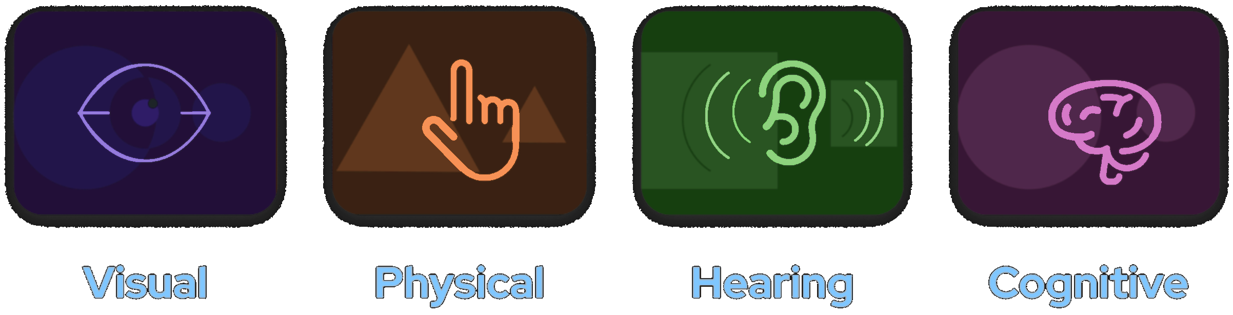
The principles we worked from included color contrast (and not relying on color alone to communicate meaning), scalable typography, appropriate labels and alt text, natural tab ordering, and closed captions for video. Small things individually, but together they meaningfully expanded who could actually use the product.
Documentation and components
Every pattern shipped with documentation: when to use it, how it behaves, and the accessibility rules it already follows. Tokens gave each theme its own look without forking the components.
What changed
A design system isn't glamorous work and now more important than ever, it's the kind of thing that makes everything else go faster. One solid foundation. One source of truth. One shared language.
New features started from shared components instead of zero, with less rework along the way.
Four products designed and built from the same library,.
Contrast, labels, tab order, and touch targets were built into components