
Honeywell Forge Dashboard Builder
An experience for internal developers to create, architect, and build dashboards.
The problem worth solving
Honeywell was on a mission to modernize the industrial workplace and that meant reducing downtime, cutting maintenance costs, and automating the slow, manual work that was eating into productivity. But the product teams doing that work across the globe were completely siloed.
Legacy software took months to update for even small changes. Process engineers were literally modeling dashboards in Excel. Teams in different business units were solving the same problems independently, with no way to share what they'd built. The cost was real: duplicated effort, slower time to market, and missed opportunities to compete.
The ask was clear: help teams build dashboards faster, make components reusable across the org, and get new value to customers without starting from scratch every time.
Understanding who we were actually building for
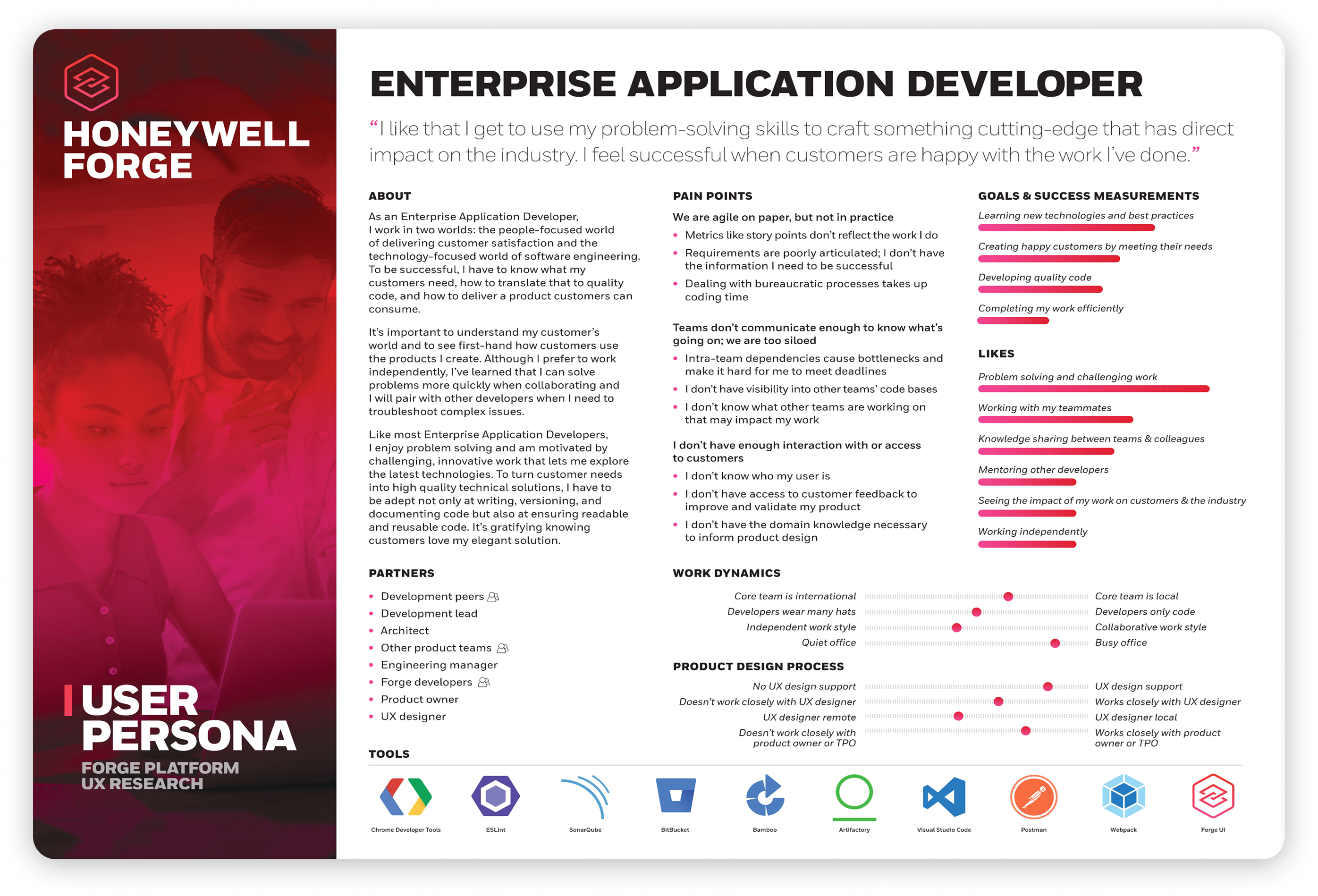
Before jumping into solutions, we did a deep dive on our primary user: the developer. We called it Developer Discovery, a research initiative where we recruited developers across the organization to talk openly about their biggest challenges, how they worked, and what slowed them down.
One thing we were intentional about: we didn't keep this research inside the design team. We required at least one designer and two developers to be involved in note-taking and synthesis for every interview. It kept the perspectives honest, and it had a useful side effect: the developers doing the building started to actually understand who they were building for. That groundwork made collaboration a lot easier down the road.
Good defaults with fewer, cleaner elements to help someone understand in five seconds or less.
A shared foundation that let each product team adapt to its context while still feeling like one Honeywell.
Always keep failure states, alarms, and safety incidents in mind. Misinterpreted data in these environments had real consequences.
Building the foundation and learning as we go
What emerged from the research was a clear picture of what developers needed: a starting point they could trust, and the flexibility to go beyond it when they had to.
We designed a drag-and-drop interface with a library of pre-configured charts and out-of-the-box data connectors, with time-series and HTTP being the most critical for the existing product portfolio. But we also knew from early adopters needed flexibility and control. So we built in an inline code editor, giving developers full control when the pre-built options weren't enough.
We focused the initial rollout on Building business units, where process engineers needed to spin up dashboards quickly for their end customers.
What I took away
The project was paused in mid-2020 when COVID reshuffled priorities across the company. It's the kind of ending no one plans for, but it taught me some things I've carried into every project since.
Working across global teams with competing needs pushed me to get much more intentional about scope. When everyone has a slightly different definition of what you're building, decisions that feel small early on compound fast. I learned that defining what something isn't is just as important as defining what it is, and that doing that work early saves a lot of pain later.